storytelling with data podcast
The storytelling with data podcast, hosted by bestselling author and data visualization expert Cole Nussbaumer Knaflic, aims to rid the world of ineffective graphs and mediocre presentations. Each episode covers topics related to data storytelling, better presentations, and all things data viz. The podcast provides practical advice and insights for improving how we communicate with data.
Episodes
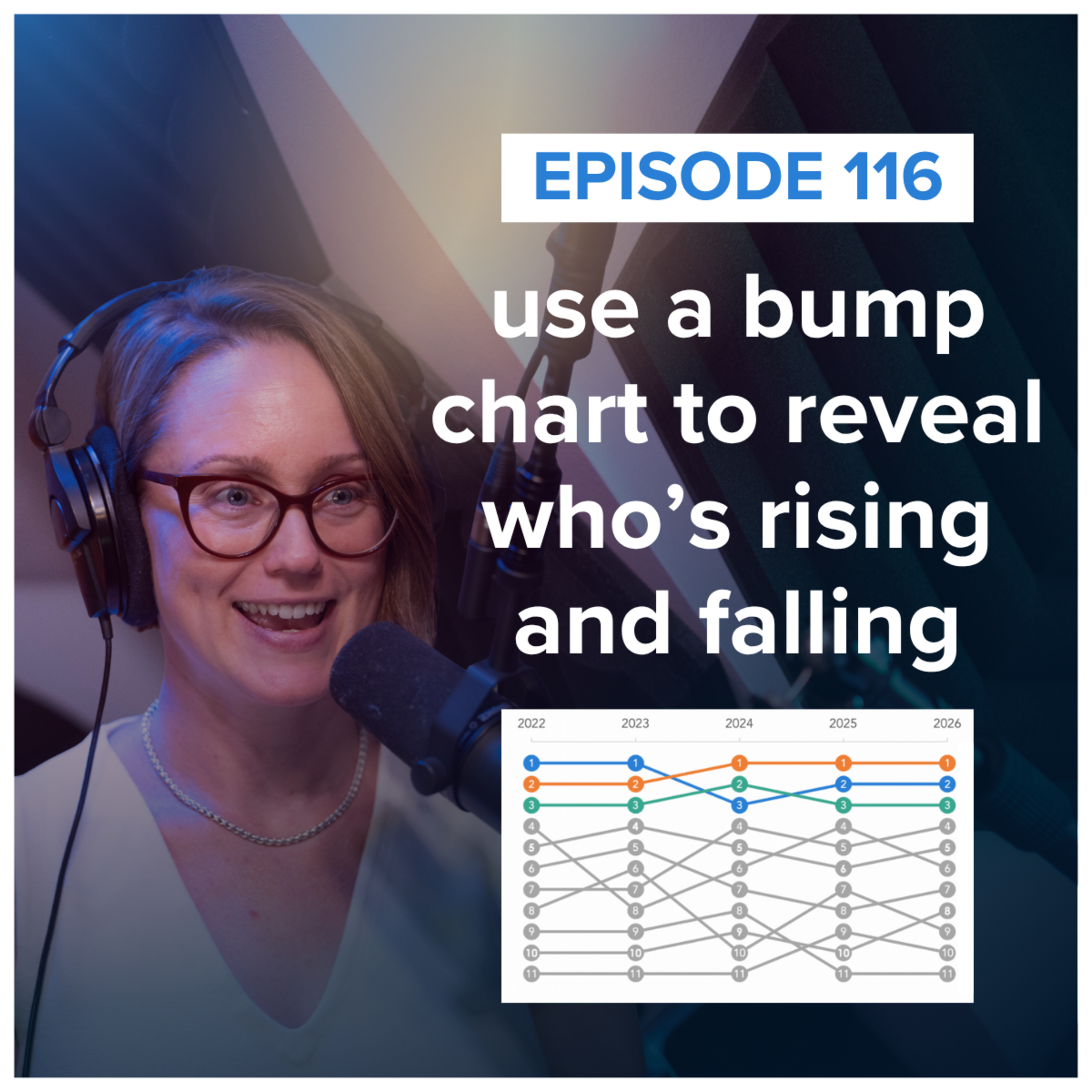
use a bump chart to reveal who’s rising and falling
Bump charts are great at showing who's rising, who's falling, and who's staying on top—but they don't tell you the whole story.In this episode, Alli explains what a bump chart is, when to use one, and what to watch out for when comparing rankings instead of actual values. Plus, she highlights three creative examples from the storytelling with data community that use color, added co
stop trying to eliminate bias from your data story
Does telling a story with data introduce bias? In this episode, Cole explores the tension between objectivity and perspective—and why simply “showing the data” isn’t as neutral as it may seem. If you’ve ever worried that storytelling could compromise rigor, learn how to bring your expertise and point of view to the data while still communicating uncertainty, limitations, and alternative interpreta
AI does (and does not) work for data storytelling
Cole recently appeared on the Analytics Power Hour, and this was such a great conversation, we're rebroadcasting it here!————There’s a version of this episode where AI replaces the data visualization expert entirely, and there’s a version where it’s useless without one. Neither is quite right, according to Cole Nussbaumer Knaflic of Storytelling with Data, who joined Tim, Moe, and Julie to sor
worth your time: 3 Outlier talks about dataviz & AI
What can AI help us see, try, or explore that we couldn’t easily do before? Alli shares three standout talks from the 2026 Outlier conference—and three lessons for using AI in data visualization: - Use AI to expand your options without outsourcing your judgment.- Give AI the information it needs to critique its work.- Use AI to find what’s worth visualizing in the first place.RESOURCES MENTIONED:S
designing transitions
What happens in the space between one thing and the next? Whether you’re moving from email to deep thinking, analysis to communication, or one idea to another, these shifts require time and mental energy. In this episode, Cole explores how thoughtfully designing transitions can help you work, think, and communicate more effectively. Discover practical ways to use time, space, movement, and other c
waterfall charts: what they are and how to use them
Waterfall charts are great at showing what happened between where you started and where you ended—but they can look a little strange if you’ve never encountered one before.In this episode, Alli explains what a waterfall chart is, when to use one, and how to make it easier for your audience to read. Plus, she highlights three clever examples from the storytelling with data community that use color,
look more confident presenting with these simple tweaks with guest Jay Sullivan
Conveying confidence when presenting often comes down to a few small, intentional choices. Jay Sullivan, author of Simply Said and communication expert at Exec|Comm, shares three simple tweaks that can make an immediate difference.You’ll learn:his smart approach to eye contactwhat the “Arc of Silence” is and how to use itthe helpful acronym “RIDE” to clearly explain a chart that you’re presentingS
how to build tension in your data story
Want to make your data story more engaging? Try adding a little tension. Join data storyteller Alli Torban as she explores how tension can create curiosity and keep your audience invested in your story.You’ll learn three simple ways to build tension—expectation versus reality, knowledge tension, and action tension—and see how members of the storytelling with data community put each technique into

how to handle the “prove me right” problem
What do you do when a leader asks you to find data to prove them right?In this episode, data storytellers Ryan Biesecker and Alli Torban explore the difference between investigating a hypothesis and validating a foregone conclusion. They share practical ways to ask better questions, approach analysis with curiosity, and navigate the tricky situation when the data doesn’t support what your leader e

help! my boss gave me a slide limit
How do you handle a presentation when your boss gives you a slide limit? Join data storyteller Alli Torban as she tackles this common presentation constraint.You'll learn why limiting slides doesn’t necessarily lead to shorter presentations, how negotiating for a time limit instead can lead to clearer communication, and practical strategies for when the slide limit truly isn’t negotiable.SHOW
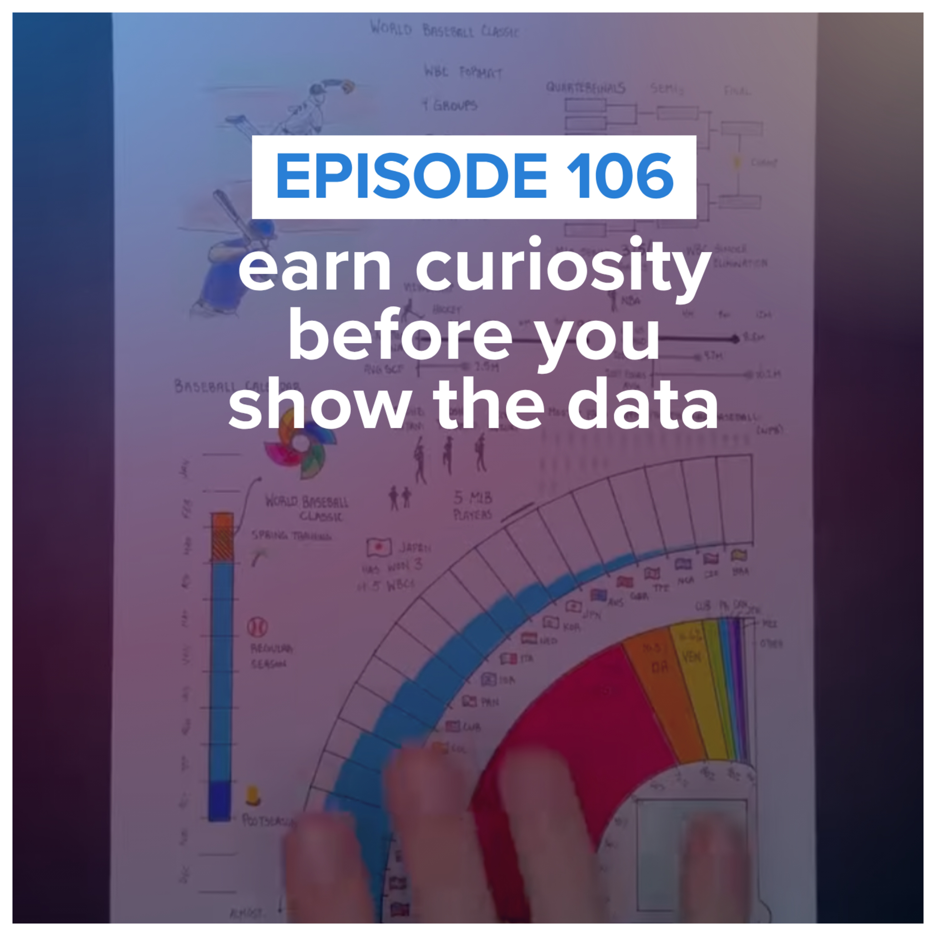
earn curiosity before you show the data with guest Riley Martin
Join data storyteller Alli Torban as she talks with Riley Martin, founder of Sportsball, about one of the hardest parts of data storytelling: getting people to care before you show the data. You'll learn how Riley translates complex topics into approachable visual stories, why he assumes his audience starts with little or no background knowledge, and practical techniques for uncovering what your a
AI is flattening your data stories (and how to fix it)
Join Cole Nussbaumer Knaflic as she shares how AI can quietly flatten your data stories. You’ll learn why AI tends to smooth over the tension that makes a story compelling, how to keep the sharp edges that move your specific audience, and practical ways to stay in control—from analog brainstorming to sharper prompts. The goal: use AI as a thought partner without letting it dilute your perspective.

the slide title mistake we see often
Join data storyteller Alli Torban as she shares a very common slide title mistake: using questions as your slide titles. You'll learn why question-based titles can divide your audience's attention, how to write a better title, and a simple bonus tip for making both your slide titles and chart titles work together. It's a small change that can make your presentations much easier to unde

how to improve your design (no artistic talent needed)
Do you have to be a designer to create better visuals?Join data storytellers Alex Velez and Alli Torban as they share practical ways to train your design eye by studying great examples, recreating charts, and seeking feedback—all while making intentional design decisions that help your audience understand your message faster. If you've ever thought, "I'm just not a designer," thi
help! my data story feels boring
Can "nothing changed" still be a compelling data story?Join data storyteller Alli Torban as she shares why "everything is performing as expected" can still be a meaningful data story. Through three examples from the storytelling with data community, you'll learn practical techniques for making "normal" meaningful by establishing expectations, adding helpful contex
how to teach data storytelling
How do you teach data storytelling—and how does that change across disciplines, audiences, and experience levels?Join data storyteller Amy Esselman and members of the storytelling with data university instructor community as they discuss how they help students move beyond analyzing data to communicating it clearly. You'll hear practical teaching strategies, including hands-on critique, real-wo

storytelling with data podcast: #100 the best episodes we’d send to a friend
In this special 100th episode, the storytelling with data team looks back at our favorite podcast moments and shares the episodes we'd recommend depending on where you are in your data storytelling journey.Whether you're learning the fundamentals, trying to create more compelling stories, thinking more strategically, influencing stakeholders, or presenting with confidence, we've curate

storytelling with data podcast: #99 learn to love critique (even if you’re sensitive)
Cole and new SWD teammate Alli talk about how to get more comfortable receiving feedback—even if you’re sensitive to critique. They explore how mindset shapes the way you hear feedback, why separating yourself from your work can unlock growth, and how building feedback into your process can help you improve faster. Along the way, they share personal stories—from Cole coaching a fourth-grade presen
storytelling with data podcast: #98 how to overcome your presentation challenges
In this episode of the storytelling with data podcast, Simon and Amy tackle common presentation challenges submitted by subscribers to the storytelling with data YouTube channel.They discuss how to turn complex analysis into a clear and engaging story, why storyboarding can help you structure your message before jumping into slides, and how to decide what to include—and what to leave out—when your
storytelling with data podcast: #97 delivering business value with data, with Shachar Meir
In this episode of the storytelling with data podcast, Amy talks with Shahar Meir, a data executive with more than 20 years of experience leading data teams at companies including Meta and PayPal. Together, they explore what it really takes for data professionals to move beyond producing dashboards and reports to driving meaningful business outcomes.Shahar shares why technology alone rarely solves
storytelling with data podcast: #95 Structure Liberates – Why Your Data Needs a Style Guide with Maxine Graze
How do you ensure your data visuals are consistently effective—and on brand? In this episode, SWD data storyteller, Simon Rowe chats with Maxine Graze, Senior Data Visualization Engineer at King, about the process of building data visualization style guides. They explore why “structure liberates,” how to balance aesthetics with usability, and why stakeholder feedback is critical. Whether you'r

storytelling with data podcast: #96 what’s the story behind your data? demystifying data equity with Heather Krause
What if the numbers you work with every day weren’t as neutral as you thought?In this episode, Mike is joined by Heather Krause, founder of We All Count and longtime quantitative researcher, to unpack a powerful concept: data equity. Together, they explore how every step of a data project—from survey design to chart choices—involves hidden decisions that impact what gets measured, who is represent
storytelling with data podcast: #94 the uncharted territory of data and music with Chris Dalla Riva
Chris Dalla Riva is a musician, data analyst, and the author of Uncharted Territory: What Numbers Tell Us about the Biggest Hit Songs and Ourselves. In this episode, he joins data storyteller Mike Cisneros to talk about musical myths, hidden industry incentives, chart data, and underappreciated hits, as well as the thorny questions about authenticity, categorization, and what it really means to te
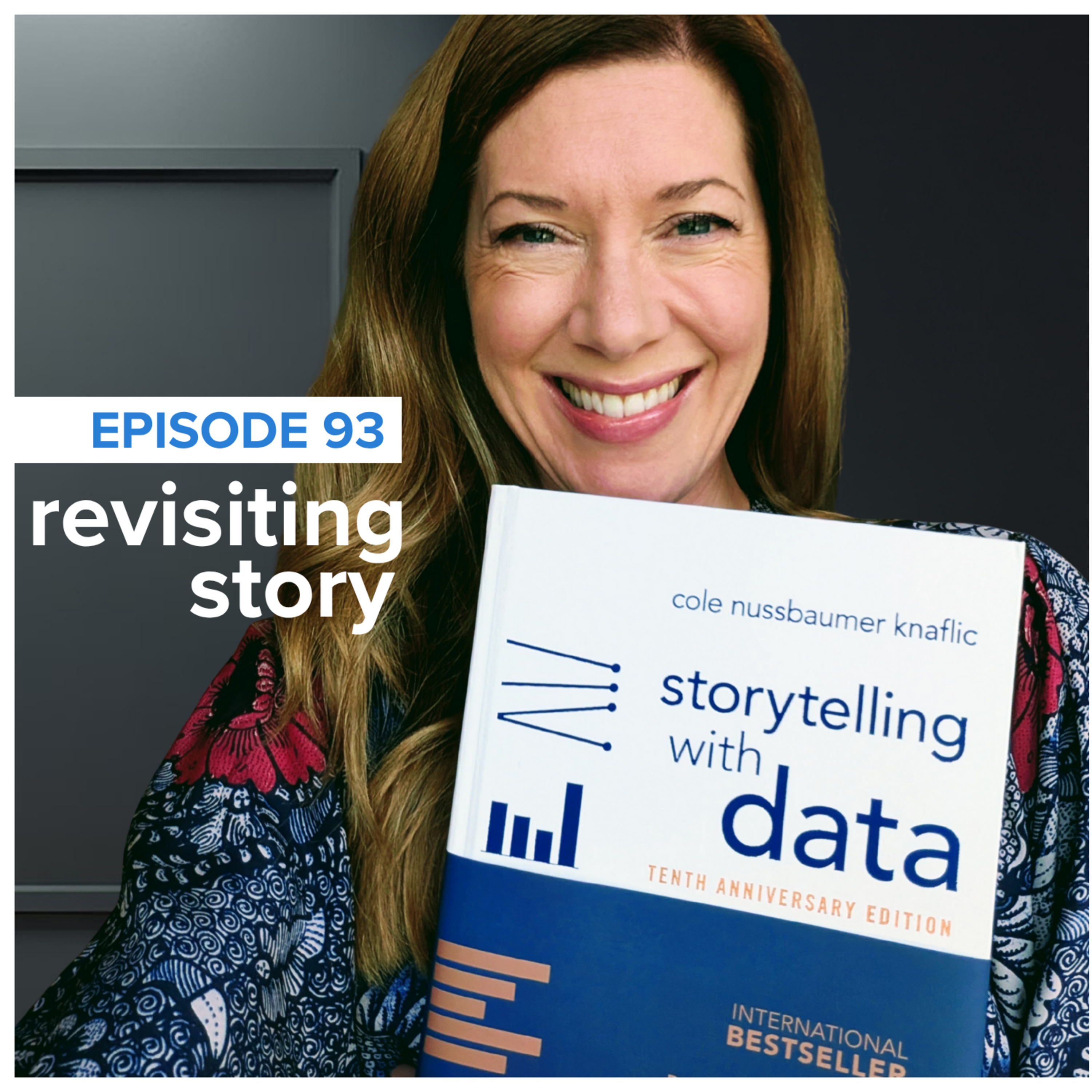
storytelling with data podcast: #93 revisiting the magic of story
In this special episode of the *storytelling with data* podcast, Cole celebrates the 10-year anniversary of her best-selling book, *storytelling with data: a data visualization guide for business professionals*. She shares exciting updates about the newly released 10th Anniversary Edition—including refreshed visuals, updated examples, and new bonus content—along with an invitation to a live virtua
storytelling with data podcast: #92 Why Dashboards Die—and How to Save Them With Allison Horst
In this episode of the storytelling with data podcast, Simon chats with Allison Horst—developer advocate at Observable, educator, and beloved data illustrator—to explore the difference between dashboards that get used and those that don’t.They dig into why so many data products go to waste, the importance of co-creating with your audience, and the overlooked power of early feedback. Allison reflec
storytelling with data podcast: #91 Dashboards that Deliver with Andy Cotgreave
Data visualization veteran Andy Cotgreave joins host Mike Cisneros for a lively, wide-ranging conversation about the evolution of dashboards, the craft of data communication, and the future of generative AI in analytics. Andy reflects on his early career building “dashboards” in Excel for a demanding boss, how that experience shaped two bestselling books (The Big Book of Dashboards and Dashboards

storytelling with data #90: ask smart questions (rebroadcast)
Asking good questions can help improve our own and others’ work: both when exploring and explaining data. In this rebroadcast of episode 19, Cole covers five smart queries to pose and answer during the analytical process and five more to consider when getting ready to explain that data to others.We’re sharing this popular episode again as we look ahead to what’s next: Before and After, the fifth b
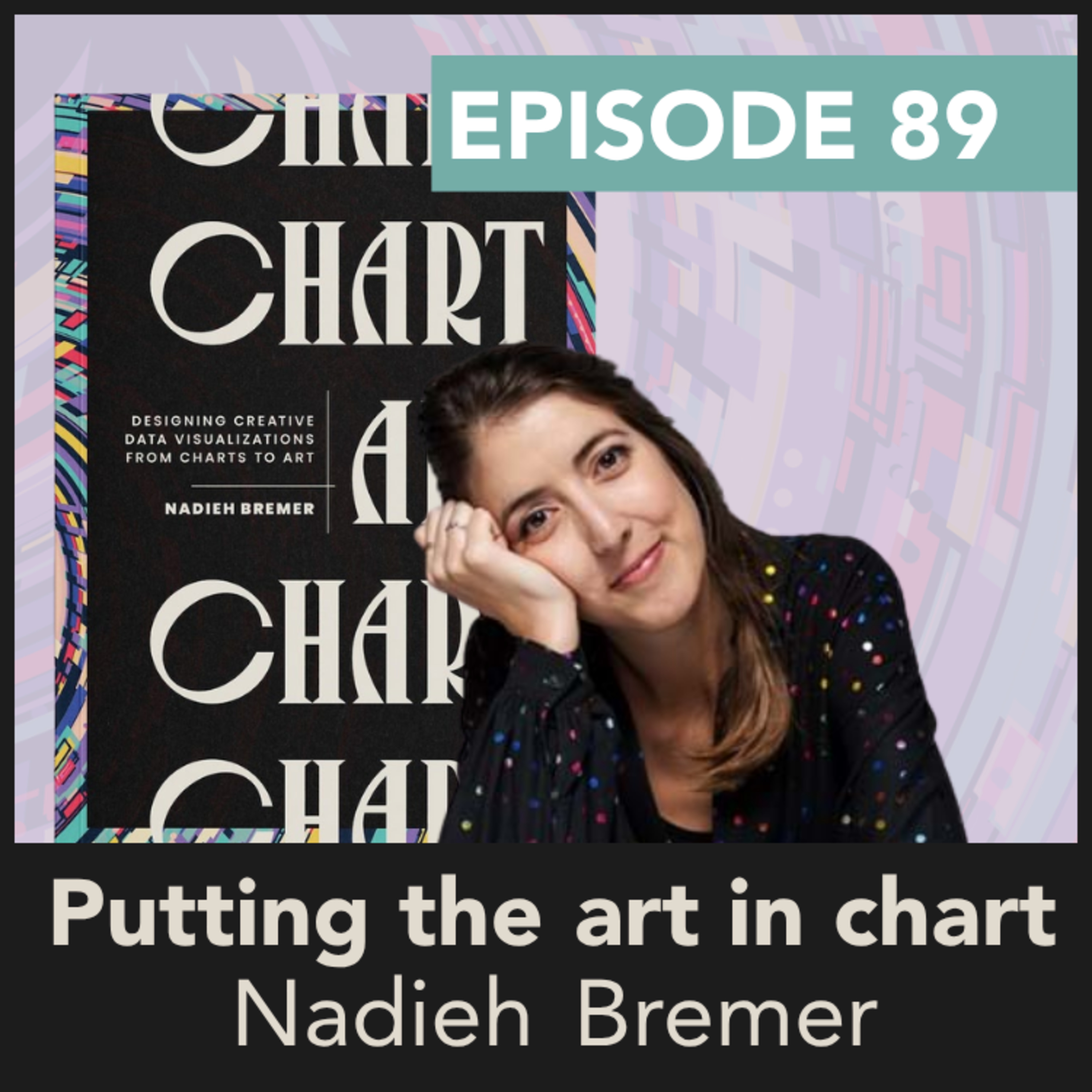
storytelling with data podcast: #89 putting the art in chart with Nadieh Bremer
Data storyteller Alex talks with Nadieh Bremer, an award-winning data visualization practitioner, about her new book, Chart: Designing Creative Data Visualizations from Charts to Art. Nadieh talks about her data visualization journey, from losing passion while creating dashboards to finding joy as she pushed the boundaries of data art. During this journey, she shares her tips for becoming a freela
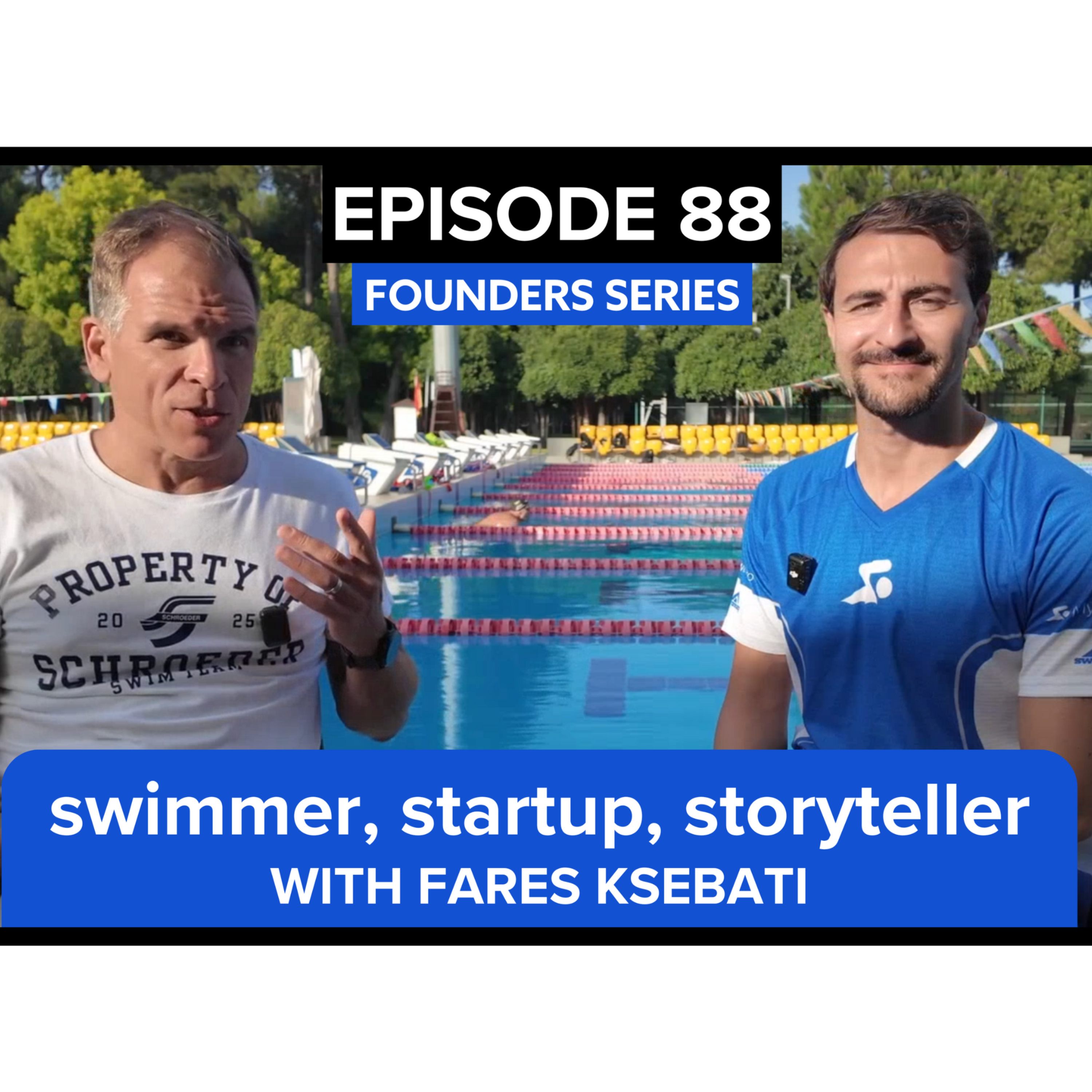
storytelling with data podcast: #88: swimmer, startup, storyteller with fares ksebati
In this founder series edition of the storytelling with data podcast, Randy sits down poolside in Antalya, Turkey with Fares Ksebati—CEO and founder of MySwimPro, YouTube creator, and author of Swim Like a Pro and How Not to Drown. From humble beginnings as a walk-on college swimmer to building one of the world’s most recognized swim coaching platforms, Fares shares the behind-the-scenes journey o
storytelling with data podcast: #87: the founder’s journey: From Lagos to Zurich to AI-Powered Insights
In this second installment of our new podcast series, The Founder’s Journey, we sit down with Odun Odubanjo, CEO and founder of Insight7, a platform making qualitative data instantly actionable.Odun’s story starts in Lagos, Nigeria, where a chance internship at Google Zurich opened a door that would eventually lead to founding multiple startups, scaling a business across Africa, working at Shopify
storytelling with data podcast: #86: speak so others listen
Want to speak in a way that makes others want to listen? In this episode, Cole dives into the art of confident communication—how to eliminate filler words, command attention with your voice and body language, and project confidence even when you don’t feel it. She shares real-world strategies from working with high schoolers, future business leaders, and university students, plus personal lessons
storytelling with data podcast: #85 what founders can teach us about storytelling & resilience
NEW SERIES: The Founder’s Journey – Stories of Building, Scaling & StorytellingWe’re launching something new on thestorytelling with data podcast! In this special series, we’ll sit down with founders who are building something remarkable—diving into their journeys, the lessons they’ve learned, and the storytelling strategies that fuel their success.In this episode, Randy is joined by Doni Pril
storytelling with data podcast: #84 mastering time
Time is a finite resource, so how do you make the most of it? Cole is joined by her husband, Randy, for a conversation on the art of getting things done, both in business and in life. From balancing busy work schedules to managing a family of five, they share their strategies for prioritization, productivity, and focus. They break down their individual approaches—covering automation, delegation, s
storytelling with data podcast: #83 reflect and refine
What if a simple pause could transform the way you work? In this episode, Cole delves into the concept of statio—a meditative pause during transitions—and its potential to inspire more thoughtful, impactful decisions in data analysis and communication. From asking the right questions at the start of a project to fine-tuning your slides before a presentation, discover how small, intentional moments
storytelling with data podcast: #82 everyday design & dataviz
What do doors, wrapping paper, and speed bumps have in common? In this episode, Cole uncovers how the design of everyday objects can inspire better graphs and slides. Through relatable stories and practical takeaways, discover how thoughtful design can transform confusion into clarity and create moments of delight for your audience.
related links:
SWD holiday shop (use code PODCAST10 for 10% off

storytelling with data podcast: #81 How to Make Math Magical for Kids: Cole & Jon Orr from Make Math Moments
In this episode, Cole teams up with Jon Orr, co-founder of Make Math Moments, for an inspiring discussion on how to transform math education for young learners. They dive into Cole's new book, Daphne Draws Data, and explore how storytelling and visual data can empower children to approach math with curiosity and confidence. Cole and Jon share personal stories and professional insights on why spark

storytelling with data podcast: #80 Inspiring The Next Generation - Daphne Draws Data
In this special episode, Cole unveils her new children's book, "Daphne Draws Data," a vibrant adventure aimed at making data, numbers and graphs accessible to young minds. Inspired by her own children's curiosity, Cole discusses the importance of introducing data literacy early through storytelling, illustrated by the talented John Skewes. Join Cole as she shares insights into creating the book, i

storytelling with data podcast: #79 Recast: Cole & EXP Milwaukee
Cole sits down with Steve Glynn in an episode recorded for the Experience Milwaukee podcast that we’ve recast here. Tune in to hear about Cole’s path, books, and…scotch?! The pair dive into Cole’s new children’s book, Daphne Draws Data: A storytelling with data adventure, talk about life in Wisconsin, and more. Listening time 23:45 | related links: Order Cole’s new book! Experience Milwa

storytelling with data podcast: #78 Visualize This with Nathan Yau
Join Cole as she chats with Nathan Yau, founder of FlowingData and author of Visualize This and Data Points. Nathan shares his journey from grad school at UCLA to becoming a renowned figure in data visualization. They discuss the evolution of his work, the inception of FlowingData, and the impact of his books on the field. Dive deep into the creative process behind visualizing data, the importance

storytelling with data podcast: #77 creativity with data, a chat with Alli Torban
Data storyteller Alex talks with information designer Alli Torban about her new book, Chart Spark. Alli believes that creativity isn’t a synonym for art; instead, it’s the ability to generate new ideas or remix existing ideas in a useful way. When you learn to harness that creativity, you can develop new approaches to create more impactful data communications. Tune in to discover helpful prompts a

storytelling with data podcast: #76 deliver with confidence
In this repost of the Data Viz Today podcast, Information Designer Alli Torban talks with Cole about strategies for delivering data presentations, particularly for introverts. From identifying and managing nervous habits to intentionally adjusting style while maintaining authenticity, they share quick tips and broad strategies to put into practice. Discover how to signal confidence, even before fe

storytelling with data podcast: #75 The Data Storyteller’s Handbook with Kat Greenbrook
Cole talks with New Zealand-based data storyteller, Kat Greenbrook, about her new book, The Data Storyteller’s Handbook: How to create business impact using data storytelling. Kat shares her empathy for anyone who has ever been told to “make your data tell a story” and isn’t sure where to start, and offers guidance for better understanding your audience and arranging insights into a narrative stru

storytelling with data podcast: #74 planning your presentation
Cole shares low-tech planning strategies that will set you up for success in any important scenario in which you need to communicate. From crafting the Big Idea (plus a super useful worksheet to assist your efforts) to storyboarding to bringing it all into your tools, you’ll learn how a little time up front can streamline the rest of the creative process. Also tune in to hear Cole address question

storytelling with data podcast: #73 stand up
Consider all of the things you do in the course of your daily work from a seated position: might you benefit from changing it up? In this episode, Cole discusses the power of standing up for different reasons and across a variety of situations. Tune in to understand how standing can boost creativity and keep updates and introductions from being overly lengthy. Learn what kinds of feedback and conv

storytelling with data podcast: #72 Alberto Cairo and the art of insight
Alberto Cairo drops by to talk about his new book "The Art of Insight," which offers a unique take on data visualization. In conversation with data storyteller Mike, Cairo shares his Camus-inspired belief that life's meaning comes from community and work, and how that conviction shapes his own interests and endeavors. They discuss the impact of artificial intelligence on journalism, how seemingly

storytelling with data podcast: #71 pre-reads are risky business
Sending slides before a meeting and asking your audience to do a pre-read has become the norm. Unfortunately, pre-reads never quite lead to the desired outcome of better questions and discussion, instead they create more challenges. Data storyteller Alex shares her thoughts on pre-reads and how she navigates requests to share content outside of a meeting. Tune in to also hear related questions on

storytelling with data podcast: #70 prepare to present
Cole walks listeners through her process of preparing for a recent presentation—from turning an idea into slides, to how she readied herself to present powerfully. Tune in to hear how a visual navigation scheme can help you stay on track as you present and create memorable takeaways for your audience, why building buffers into your presentation is key for staying on time, the major benefits of pra

storytelling with data podcast: #69 feedback you hate to receive
Whether you’ve asked for it or not, sometimes critique from others simply gets under our skin. From feel-good platitudes that lack actionability to outright requests to manipulate data—Cole covers five categories of common graph and slide feedback that people hate to receive. Tune in to learn strategies and practical tips that will help you turn undesirable feedback into useful and insightful inpu

storytelling with data podcast: #68: tips for successful data stories
What does Cole’s 7-year-old daughter have in common with the typical audience member for your data stories? Tune in to find out! In this short episode, Cole discusses a handful of specific things you can do to help set yourself—and others—up for successful data stories. Listening time 12:29 | related links: Resource: the BIG PICTURE worksheet Related SWD community exercise: the big picture

storytelling with data podcast: #67 storytelling withOUT data
Graphs and slides are often the first tools we reach for when we need to communicate with data—but when might storytelling withOUT data yield better results? Cole outlines numerous scenarios for alternative approaches, sharing examples from clients, workshops, and her books. From boardgames to baby pics, tune in to learn about humanizing data, when low fidelity solutions work best, the Pictu
storytelling with data podcast: #66 Designing in Light and Dark
Mike and Alex discuss the advantages and drawbacks of designing visualizations with light and dark backgrounds, using examples from SWD community members to highlight where each approach can be preferable. Then, they dive into history and discuss the staying power of some famous graphs. What makes them memorable—and how we might be able to elevate them, using modern tools and perspectives? Listeni

storytelling with data podcast: #65 EMPHASIZE it!
Cole draws on a recent experience that underscored the power of thoughtful EMPHASIS. Tune in for practical tactics to create contrast visually and verbally, whether for important numbers or words, focusing attention within your table or graph, or communicating clear emphasis through how you speak and move. Cole and colleague Simon also address related questions on tips for virtual presentations, e

storytelling with data podcast: #64 beginner mistakes in data viz
You'll probably make a few mistakes when learning to visualize and communicate data. That's okay! It's all a part of the learning journey and can be preferred since we often learn more from our mistakes than our successes. SWD storyteller Alex embraces her early missteps as she takes a trip down memory lane to share where she went wrong and what she learned. Listening time 18:11 plus intro/o
storytelling with data podcast: #63 bad news and good feedback
SWD storytellers Elizabeth and Mike join forces to tackle some thorny questions about connecting with your audience: how do you know if you’ve done a good job, and what if you have to deliver bad news? In light of a recent “partner up!” challenge in the SWD community, they explore the benefits of working together with colleagues, friends, strangers, and even family members, while sharing some less
storytelling with data podcast: #62 tension in data stories
Tension is a key component of story—and can be used in powerful ways to communicate in a business setting. In this episode, Cole talks tension: what it is, why you should care, and how to identify and use it in your data stories and beyond. Tune in also to hear common questions related to communicating with tension and their answers, plus related resources that will improve your next graph or pres
storytelling with data podcast: #61 AI, quantified self, and fingernails
SWD storytellers Simon and Mike offer their thoughts on how the recent advancements in AI tools may transform the way we analyze and communicate with data. They also discuss some of their favorite entries and interesting themes from the most recent SWD challenge on the quantified self. related links: Website: SWD challenge A year of fitness by Evelina Judeikyte Numb
storytelling with data podcast: #60 scale with purpose with Brendan McGurgan
Have a listen to this cross-cast of Cole’s conversation with Brendan McGurgan, host of the ScaleX Insider Podcast and author of Simple Scaling: Ten Proven Principles to 10x Your Business. They discuss scaling organizations and dive deep into the topics of audience, the big idea, storyboarding, using tension to engage your audience, plus tips for improving how you present through practice. related
storytelling with data podcast: #59 questions in dataviz with Neil Richards
Why don’t we use triangles in charts more often? Can design considerations come before we have the data? Do we take data visualization too seriously? Author, speaker, and data literacy advocate Neil Richards raises (and occasionally answers) these and other questions in his new book, Questions in Dataviz: a Data-Driven Process for Data Visualization. In this episode, Neil stops by the podcast to t
storytelling with data podcast: #58 don’t! (and what to do instead)
Cole shares a number of data visualization and communication questions that could be answered simply with the word, “Don’t!” From breaking axes and presenting boxplots to unfamiliar audiences, to providing unsolicited feedback to a colleague, and more—you’ll learn why generally not to take these actions, plus hear ideas on what you might do instead. related links: Video: the ins & outs of boxplot
storytelling with data podcast: #57 storytelling with YOU
Cole sits down with husband, Randy Knaflic, for a fun chat about her new book, storytelling with you: plan, create, and deliver a stellar presentation. They discuss why building capability and confidence presenting is especially important for those in technical roles, overcoming challenges communicating to mixed audiences, navigating the writing process, and more. Tune in to learn what jazz improv
storytelling with data podcast: #56 graph draft!
As anyone who has ever participated in a fantasy league can tell you, the most fun part of the whole experience is drafting your team. We took that idea to heart, and imagined, “What if, instead of drafting professional athletes, we did a fantasy draft of chart and graph types?” The data storytellers at SWD and premium members of our online community recently did just that, taking part in a (mostl
storytelling with data podcast: #55 functional aesthetics with Dr. Vidya Setlur & Bridget Cogley
How can we use beauty to convey meaning, and form to guide function, in our communications? In this episode of the SWD podcast, Dr. Vidya Setlur and Bridget Cogley explore these questions with data storyteller Mike Cisneros. In their upcoming book Functional Aesthetics for Data Visualization, Vidya (the “academic”) and Bridget (the “practitioner”) explore the relationships among what we see, how w
storytelling with data: #54 storytelling, folklore, and data with Joshua Smith
Data storyteller Mike Cisneros sat down with Iron Viz champion, Tableau Visionary, and self-described “data jackalope” Joshua Smith to talk about how folklore—the study of how information is communicated, primarily through informal means—provides us a fascinating lens through which to examine how data visualization has evolved and continues to develop, both as a discipline and as a community of pr
storytelling with data: #53 Shashank Kalanithi interviews Cole
Recently, Cole chatted with senior data analyst Shashank Kalanithi for his YouTube channel, where he helps people break into the world of analytics. Listen to this repost of their conversation—you’ll hear Cole reflect on a wide range of topics, from why technical experts should double down on communication skills, to the ideal tech stack, to advice for undergrads, graduate students, and those tran
storytelling with data: #52 you asked...
Through our workshops, we get the rare opportunity to meet thousands of people every year, across a huge variety of industries, companies, and roles. We never know what kinds of questions we’re going to be asked. In this episode, SWD storyteller Mike Cisneros highlights a few recent notable questions, ranging from chart choices, to design, to presentation. The range of topics may be broad, but the
storytelling with data: #51 the path to trusted advisor
How can you position yourself—and your team—to be a valued analytics consultant by your stakeholders and clients? Cole talks with Simon Rowe, the newest data storyteller on the SWD team, about his experience and tips for building productive partnerships. Tune in to hear about the journey from reactive to proactive data analytics, including practical strategies you can employ to avoid missteps, bui
storytelling with data: #50 data viz research with Steven Franconeri
“I want to be able to show it and say, doesn’t that feel good? And you know what? We actually know it works well, it’s not just your intuition.” In this episode, Cole talks with Northwestern University professor and director of the Visual Thinking Lab, Dr. Steven Franconeri. Hear about research that helps us understand and harness the limits of our visual system and how it can be translated into p
storytelling with data: # 49: become a data viz superstar
Establish yourself as a well-respected data visualization practitioner. Cole shares five points that will help you do it. Tune in to hear tips and tactics for setting good goals, learning, evaluating your work, influencing others, and getting the support you need to become—or help members of your team become—a data visualization and storytelling superstar, followed by Q&A. Subscribe to the SWD Y
storytelling with data: # 48: the challenges of change
Have you encountered challenges in your attempts to drive change with data visualization? In this episode, Cole talks with SWD’s newest data storyteller, Amy Esselman, about the difficulties that can arise when you try to impact people’s perceptions and behaviors. You’ll hear about Amy’s research on the status quo bias and her encounters with it in real life. Tune in also for a conversation about
storytelling with data: #47 the art of the interview
Fresh off a successful search to expand the SWD team, Cole chats with SWD advisor, husband Randy Knaflic, about a critical part of the hiring process: interviewing. Randy shares tips learned and stories lived over a career of hiring talent, from Google to SpaceX to storytelling with data. From showing compassion for a nerve-racked candidate to strategies for thoughtfully crafting and effectively a
storytelling with data: #46 questions about questions
"There's so much value to be gained in the exchange that happens after someone asks a really good question." The Q&A portion of a presentation is important, but the uncertainty can also be intimidating. When should you solicit questions, and for how long? What do you do when a query is off-topic? What if you don't know the answer? Tune in to hear Cole and Alex talk about preparing for successful a

storytelling with data: #45 the power of post-its
Tune in to hear Cole discuss one of her favorite low-tech planning strategies: storyboarding. Small, sticky, and sublimely potent when used well—she details her penchant for post-it notes and process of using them to brainstorm, edit, and solicit feedback to create shorter, targeted, and generally more effective communications. Article: give it time Book: Info We Trust by RJ Andrews Book: Let’s P
storytelling with data: #44 The Big Picture with Steve Wexler
Cole talks with professional “chart looker-atter” Steve Wexler, about his new book The Big Picture: How to Use Data Visualization to Make Better Decisions—Faster. Tune in for a conversation centered around evangelizing the transformative power of data visualization in an organization, including the value of visualizing for “aha!” (not “ooh and aah”), increasing data fluency, and the importance of
storytelling with data: #43 misleading graphs
A good data visualization can reveal and communicate insights. But bad graphs abound. In this episode, Cole chats with Ben Jones about misleading graphs. They discuss a number of common issues, including missorted time, miscalculated area, going against expected norms, spurious correlations, and more. Tune in for tips on how to read graphs and spot issues and avoid being duped, as well as strategi

storytelling with data: #42 there is still an art to feedback
Giving good feedback to others—when done well—can help you sharpen your own thinking and approaches for visualizing and communicating with data. We’ll start with this critical topic in our new 10-week course, so it seemed like the perfect timing to repost the original episode of the storytelling with data podcast. I discuss the value of giving and receiving data visualization feedback and potentia

storytelling with data: #41 maps with Kenneth Field
“You don’t have to be a cartographer to make a great map.” Cole talks with cartographer Kenneth Field, author of the award-winning book, Cartography. Tune in to hear the thought process for visualizing data when the “where” matters, including different types of maps, how purpose and audience should drive design decisions, and whether there’s any such thing as a truly accurate map. Plus, learn how
storytelling with data: #40 Data Sketches with Shirley Wu & Nadieh Bremer
“For data visualization, you don’t need to be an artist to make good sketches.” Cole talks with Data Sketches authors, Shirley Wu and Nadieh Bremer, about their multi-year project that has been turned into a beautiful new book. Listen as they discuss their exploration of the creative side of data visualization through colors, shapes, math, code, and storytelling. Tune in to learn why you should gi
storytelling with data: #39 Better Data Visualizations with Jon Schwabish
Cole talks with Jon Schwabish about his latest book, Better Data Visualizations. Tune in to hear about Jon’s goal to make people aware of a wider array of graphs, which less common graphs he wishes people would use more, his favorite Sankey diagram, and how Luxembourg highlighted an important lesson about maps. Jon also addresses viewer questions on fact-checking, communicating qualitative data, a
storytelling with data: #38 hi, my name is...
Being able to introduce yourself eloquently and in a way that captures and keeps your intended audience’s attention is a hugely important thing. Yet, we don’t commonly devote a lot of time or thought to planning how we do this. In this episode, Cole shares the process that she and the storytelling with data team used to create their intros, plus shares the steps you can use to form your own inspir
storytelling with data: #37 it's for THEM
How can you get people’s attention on what you want to share and drive the action you seek? Carefully consider your audience. In this episode, Cole dives deep on audience, discussing ways to identify who they are and prioritize their needs, strategies for approaching the challenging but common case of the mixed audience, and tips for getting to know an unfamiliar audience. She also addresses liste
Recommended
The Swerve Podcast: Obscure Topics | Conspiracy Theories

The Bread and Banter Podcast

The Church of What's Happening Now: The New Testament

Busted Open

Deadline: White House

Panda Show - Picante

Crickets Corner

History of the Earthquake and Fire in San Francisco

Fox news

K-Drama Obsessed Mamas | Beyond “Just One More Episode!”

True Crime Classics

The Healer Revolution
